Continued Formatting
Overview
Teaching: 0 min
Exercises: 0 minQuestions
How do I perform more advanced formatting with LaTeX?
Objectives
Learn how line breaking works in LaTeX
Learn how LaTeX handles fonts and sizes
Learn the most basic text formatting functions
Break a body of text into sections
Learn the justification commands
Learn how to change text color
Hyphenate custom words
Use quotation marks the LaTeX way
Use some symbols which have special character sequences
Use non-qwerty characters
Use the various dash signs
Learn simple spacing commands
Learn to enable/disable ligatures
In this episode we will learn the basic elements of LaTeX formatting options.
When and How Lines Break
Remember that LaTeX files are like code, this means that they are compiled like code. In many programming languages, line endings do not mean the code stops compiling. Similarly, in LaTeX, a single line ending will continue the same block of text as the first line. This is convenient for text editors that do not have automatic line breaking enabled (e.g. Windows Notepad). So how do we start a new paragraph in LaTeX? Easy, use two newline or carriage returns (i.e. press Enter twice).
\documentclass{article}
\begin{document}
  This line and
  this line are the same paragraph

  We use two newlines to start a new paragraph
\end{document}

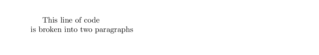
We can also manually break lines with the \\ command. This special character allows us to
include a line break within a line of our LaTeX code. Note that a line break is not the same as
starting a new paragraph. Manual line breaks will not automatically indent.
\documentclass{article}
\begin{document}
  This line of code\\is broken into two paragraphs
\end{document}
Typeface Controls
In modern WYSIWYG editors, we are used to having many choices
for typefaces and font size, many of which don’t have much practical use. LaTeX keeps things clean and simple, by limiting our options. When the original TeX was invented, there was no format for fonts like exist today. Indeed, the
pdflatex command we are using to compile our documents does not support custom fonts without a
bit of work. But that is ok! For academic work, using complicated typefaces can actually distract
from the content.
For our work, we will limit our choices to the following:
Font Families
| Family | Definition |
|---|---|
| \rmdefault | “Roman” or “Serif” font, default |
| \sfdefault | “Sans Serif” font |
| \ttdefault | “Monospace” font |
We can switch between these font families in the preamble of the document by telling LaTeX to renew which font it will be using.
\documentclass{article}
\renewcommand{\familydefault}{\sfdefault}
\begin{document}
  This text will be sans serif.
\end{document}

A renewcommand line, can only be used in the preamble. It’s function is to modify what the
default settings for the class are before text parsing begins.
If you want to use a different typeface than the default LaTeX one called
Computer Modern, you must call a package which interprets font file types such as.ttfcorrectly. This package is calledfontspec. Usingfontspec, we can tell LaTeX to assign different.ttffiles to the various font families. However, if you want to do this you must usexelatexorlualatex. These are alternatives to thepdflatexwe will be using for the duration of this material. Therefore, we will not be covering it in detail here. Consult the documentation of your LaTeX editor for how to change it intoxelatexorlualatexmode.\documentclass{article} \usepackage{fontspec} \setmainfont[ Ligatures=TeX, UprightFont = Courier-Boo, ItalicFont = Courier-BooObl, SmallCapsFont = CourierSC-Boo, BoldFont = Courier-Dem, BoldItalicFont = Courier-DemObl ] \begin{document} We will now use the Courier font familes \end{document}
Relative Typeface Sizes
To change the size of the text when it is compiled, we need to change the font size. In our
WYSIWYG editors, we are used to selecting the specific
size of a font in point(pt) units. However, in LaTeX, sizes are relative. The smallest text
in one kind of document class may be the largest in another. Therefore, we use relative size
names. When we call a new font size from tiny to Huge
| Commands (Smallest to Largest) |
|---|
| \tiny |
| \scriptsize |
| \footnotesize |
| \small |
| \normalsize |
| \large |
| \Large |
| \LARGE |
| \huge |
| \Huge |
Remember, that changing font size is like renewcommand. When we change the font size for our
document, the size change continues until we tell it otherwise. If you wish to have a small
portion of text a different size, you will need to switch back to normalsize when you are done.
Alternatively, we can use curly braces to enclose our changes. This will keep any size changes confined to a certain portion of text.
\documentclass{article}
\begin{document}
  We only want {\Huge these words} to be big.
\end{document}

If you simply must use specific font sizes, you need to use a different compiler. Like before,
pdflatexdoes not support font sizes beyond certain bounds. If you want this kind of control, you must use eitherxelatexorlualatex.
Text Formatting (weight, shape, etc.)
LaTeX can modify the format of the text in many of the usual ways including making text bold nad underlined. To do this, we must call a command. The text which is included between the curly braces at the end of the command will be in the format specified. This is also a way to temporarily change the typeface family being used.
A Table of Common Text Formatting Options
| Command | Result |
|---|---|
| \textnormal{} | document font (default) |
| \emph{} | emphasis |
| \textrm{} | roman font |
| \textsf{} | sans serif font |
| \texttt{} | teletypefont (monospace) |
| \textup{} | upright shape (default) |
| \textit{} | italic shape |
| \textsl{} | slanted shape |
| \textsc{} | Small Caps |
| \uppercase{} | ALL CAPS |
| \lowercase{} | all lower case |
| \textbf{} | bold weight |
| \textmd{} | medium weight (default) |
| \textlf{} | light weight |
| \textsubscript{} | subscripted characters |
| \textsuperscript{} | superscripted characters |
\documentclass{article}
\begin{document}
  Some text is \textbf{bold}, and some is \emph{emphatic}.
\end{document}

Sections
Information is best displayed when well organized and in bite-sized parts. For this reason, nearly all documents are split into various sections. A book has chapter, an article has sections, etc. In LaTeX documents can be divided into multiple types of sections with different hierarchy levels. The default configuration of LaTeX has several of these built in, and certain styles have even more:
Section Levels
| Command | Level |
|---|---|
| \part{} | -1 |
| \chapter{} | 0 |
| \section{} | 1 |
| \subsection{} | 2 |
| \subsubsection{} | 3 |
| \paragraph{} | 4 |
| \subparagraph{} | 5 |
Each of these sections can have different formatting depending on the style sheet which has been declared. The sections are numbered, and automatically update the numbering information based on the position when compiling. The title of the section is entered into the curly braces of the command, and all of the text below the command, until the section is changed, is formatted for that particular section level.
It is a best practice to use tabs (four spaces) to denote text within sections. That makes it easier for anyone reading the code to understand it. For example, the text starts out with no indents, then all text within the
documentenvironment is indented once. All text within the firstsectionis indented once more. Text in asubsectionis indented yet again. And so on.\documentclass{article} \begin{document} \section{Introduction} Some introductory text. \subsection{Specific Intro Information} The specifics. \section{Conclusion} Concluding remarks. \end{document}
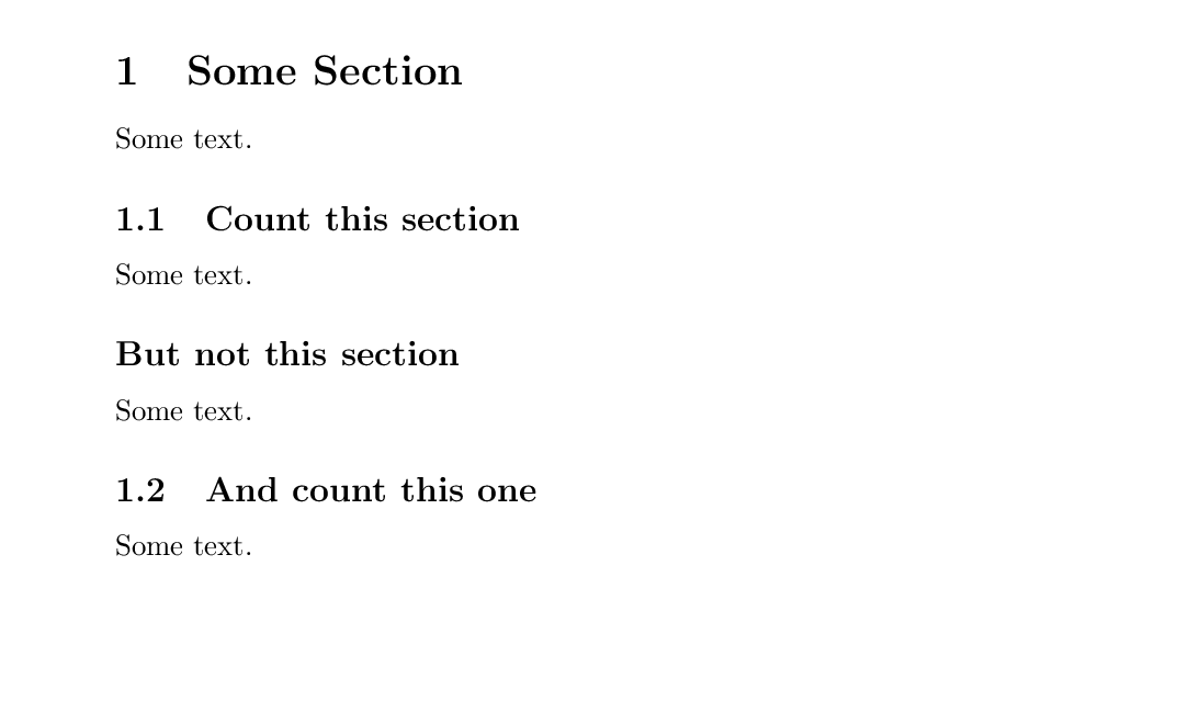
Each time the document encounters a section, it will print the title of the section and the number.
However, in certain cases, sections should not be given numbers. To prevent a section from
increasing the counter and printing the section number, an asterisk (*) is added to the command.
\documentclass{article}
\begin{document}
  \section{Some Section}
    Some text.
    \subsection{Count this section}
      Some text.
    \subsection*{But not this section}
      Some text.
    \subsection{And count this one}
      Some text.
\end{document}
Alignment
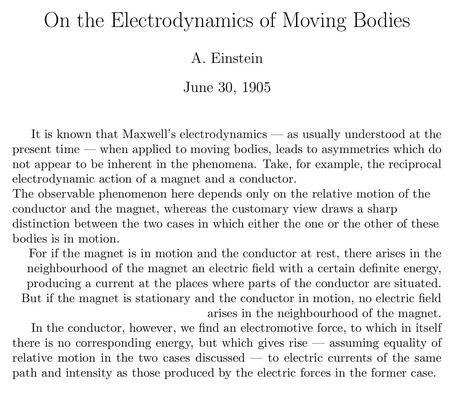
In most cases the default paragraph alignment is fully justified - aligned on the left and right margins. Use the following to change alignment:
Alignment Options
| Command | Result |
|---|---|
| \raggedleft | align right |
| \raggedright | align left |
| \centering | centered |
\documentclass{article}

\author{A. Einstein}
\title{On the Electrodynamics of Moving Bodies}
\date{June 30, 1905}

\begin{document}
\maketitle

It is known that Maxwell's electrodynamics --- as usually understood at the present time --- when applied to moving bodies, leads to asymmetries which do not appear to be inherent in the phenomena. Take, for example, the reciprocal electrodynamic action of a magnet and a conductor.

{\raggedright
The observable phenomenon here depends only on the relative motion of the conductor and the magnet, whereas the customary view draws a sharp distinction between the two cases in which either the one or the other of these bodies is in motion.

}

{\raggedleft For if the magnet is in motion and the conductor at rest, there arises in the neighbourhood of the magnet an electric field with a certain definite energy, producing a current at the places where parts of the conductor are situated. But if the magnet is stationary and the conductor in motion, no electric field arises in the neighbourhood of the magnet.

}

In the conductor, however, we find an electromotive force, to which in itself there is no corresponding energy, but which gives rise --- assuming equality of relative motion in the two cases discussed --- to electric currents of the same path and intensity as those produced by the electric forces in the former case.

\end{document}
Color
Color is not native to LaTeX, and must be handled by an external package. There are several
options for packages which handle color, but we will be using xcolor. This is a modernized
variant of the original color package. To make some text have color, we use the command
textcolor:
\documentclass{article}
\usepackage{xcolor}
\begin{document}
  \textcolor{cyan}{This text will be cyan}
\end{document}

LaTeX knows only a few colors by default:
Default Colors
| Color | Color | Color | Color |
|---|---|---|---|
| black | blue | brown | cyan |
| darkgray | gray | green | lightgray |
| lime | magenta | olive | orange |
| pink | purple | red | teal |
| violet | white | yellow |
If we want to use another color, we need to make it. Colors are made in different colorspaces
such as RGB or cmyk. We can mix colors in these colorspaces and assign them a name using
definecolor in the preamble of our document. The new color is named, we declare a colorspace,
then we provide the values for that colorspace which represents our color. Each time we want to
use the color, we can call it in the normal way.
\documentclass{article}
\usepackage{xcolor}
\definecolor{crimson}{RGB}{52, 9, 9}
\begin{document}
  \textcolor{crimson}{This text will be crimson}
\end{document}

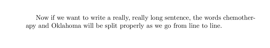
Custom Dictionaries
LaTeX is a powerful typesetting tool that automatically hyphenates words across new lines. While
some text editors simply break the line before a long word is used, LaTeX will try to hyphenate
between syllables of the word. This makes the output text look much cleaner and professional.
However, LaTeX is not magic. Not all words are defined syllabically in the dictionary. When we
use a word that is more complicated, and is in danger of making ugly line breaks, we need to tell
LaTeX how to break the word apart. We do this with the hyphenation command in the preamble.
Each word is separated by a space.
Certain words are more likely to need hyphenation. These include proper nouns and words that are relatively “new”.
\documentclass{article}
\hyphenation{Ok-la-ho-ma che-mo-ther-apy}
\begin{document}
  Now if we want to write a really, really long sentance, the words chemotherapy and Oklahoma
  will be split properly as we go from line to line.
\end{document}
Quotation Marks
Fancy Characters with Escaped Sequences
As we have seen, certain characters are used by the LaTeX code to do certain commands. The percent
sign (%) is used for comments and the curly braces ({, }) contain code. What do we do if we
want these characters in our text? We need to use a special
escape sequences to introduce these characters.
There are many of these types of characters, and they can be called in the text at any time.
Table of Special Characters
| Command | Character |
|---|---|
| \% | % |
| \$ | $ |
| \{ | { |
| \_ | _ |
| \P | ¶ |
| \ddag | ‡ |
| \textbar | | |
| \textgreater | > |
| \textendash | – |
| \texttrademark | ™ |
| \textexclamdown | ¡ |
| \textsuperscript{2} | ² |
| \pounds | £ |
| \# | # |
| \& | & |
| \} | } |
| \S | § |
| \dag | † |
| \textbackslash | \ |
| \textless | < |
| \textemdash | — |
| \textregistered | ® |
| \textquestiondown | ¿ |
| \textcircled{a} | ⓐ |
| \copyright | © |
| \ldots | . . . |
Since LaTeX is an old language, certain characters are not present within the default configuration. These characters must be called using a package. One notable example is the Euro currency sign. This currency did not exist in the 1970’s so we can’t use it without defining it in a package.
\usepackage[gen]{eurosym}
Accented Letters
Sometimes words used in the academic context use symbols that are outside of what is considered “normal” English orthography. Many language use character accents to distinguish sounds that use similar vowels. LaTeX is capable of generating these characters based on special sequences which modify existing letters.
Table of Accented Characters
| Command | Sample | Description |
|---|---|---|
| \`{o} | ò | grave accent |
| \‘{o} | ó | acute accent |
| \^{o} | ô | circumflex |
| \“{o} | ö | umlaut, trema or dieresis |
| \H{o} | ő | long Hungarian umlaut (double acute) |
| \~{o} | õ | tilde |
| \c{c} | ç | cedilla |
| \k{a} | ą | ogonek |
| \l{} | ł | barred l (l with stroke) |
| \={o} | ō | macron accent (a bar over the letter) |
| \b{o} | o | bar under the letter |
| \.{o} | ȯ | dot over the letter |
| \d{u} | ụ | dot under the letter |
| \r{a} | å | ring over the letter |
| \u{o} | ŏ | breve over the letter |
| \v{s} | š | caron/háček (“v”) over the letter |
| \t{oo} | o͡o | “tie” (inverted u) over the two letters |
| \o | ø | slashed o (o with stroke) |
Hyphenation Differentiation
In English, different hyphens are used for different meanings. These can be printed in the text
by including different numbers of short hyphens in the code. The obvious outlier here is the minus
sign. Using math requires entering math mode,
something which will be covered in more detail later. For now, it is worthwhile to note that math
symbols can be used within the text by surrounding the symbol with the dollar sign ($).
Table of Dashes
| Input | Output | Purpose |
|---|---|---|
- |
- | inter-word |
-- |
– | page range |
--- |
— | punctuation |
$-$ |
− | minus sign |
Controlling Space
Often it is important to control the space around words and blocks of text in a document. We can group instances in which this is important into horizontal space (left and right) and vertical space (above and below).
Horizontal Space
As should be apparent, LaTeX respects spaces between words written in the code. However, there are
limits. Consecutve spaces grouped together are treated as a single space. This allows LaTeX to
always print a correct looking document, no matter how a user chooses to space out their words. If
an extra space is required, LaTeX needs to be told this. Entering the tilde (~) into the code
tells LaTeX to add another space, no matter the circumstances.
This has a secondary use. Some words should appear together on a line to make sense, such as acronyms and names. By replacing the normal space with the tilde, we treat those words as a single string when it comes to wrapping the text on the page, yet still print a space between each word.
Vertical Space
Controlling vertical space is similar to horizontal space. As we discussed early in this section,
LaTeX requires double returns to break a paragraph, and a line break can be forced with \\.
One caveat is that each forced line break must include something on the next line. Therefore the
sequence \\\\ is meaningless and will cause errors. If you want to skip more than one line
without including any text on the next line, the simplest way to do this is with a tilde. The
sequence \\~\\ will skip two lines.
Another convenient vertical spacer is the skip. Using the command \smallskip, \medskip, or
\bigskip will produce a small, medium, or large blank space between lines of text. This is
useful for distinguishing portions of a document. The lengths of these skips are dependent on
the documentclass you are writing in.
The largest vertical spacer available is the \newpage command. As you might expect, this forces
LaTeX to end the current page and start a new one at that point.
There are many other options for controlling space, with much more refinement. However, that begins to get more complicated than we will cover in this course. For now, stick with these.
Key Points
Separate a single paragraph into two with a double return
Break lines manually using
\Change the typeface to
courierChange text size with
LargeFormat with
textbf,textit,underline,emphCreate Sections in a document with
sectionAlign some text to the right with
raggedrightCreate hyphenation for new words with
hyphenationUse ` and ‘ to create proper quotes
Use
%to display percentagesCreate a diacritic character such as
^oProperly use an em and an en dash
Force a nonbreaking space with
~